 Rare Maps
  Rare Atlases
  Rare Books
  Rare Prints
  Globes and Planetaria
 Sign up to hear about our latest acquisitions, exhibitions and events


Find Us
New York
PO Box 329, Larchmont, NY, USA
Opening hours, London Gallery
Monday to Friday: 10:00 – 18:00
Saturday: by appointment
Closed: all bank holidays and 1-31 August
Opening hours, New York
By appointment only
Opening hours


An Atlas of England and Wales.
- Author: SAXTON, Christopher
- Publication place: London
- Publisher: Christopher Saxton
- Publication date: 1579.
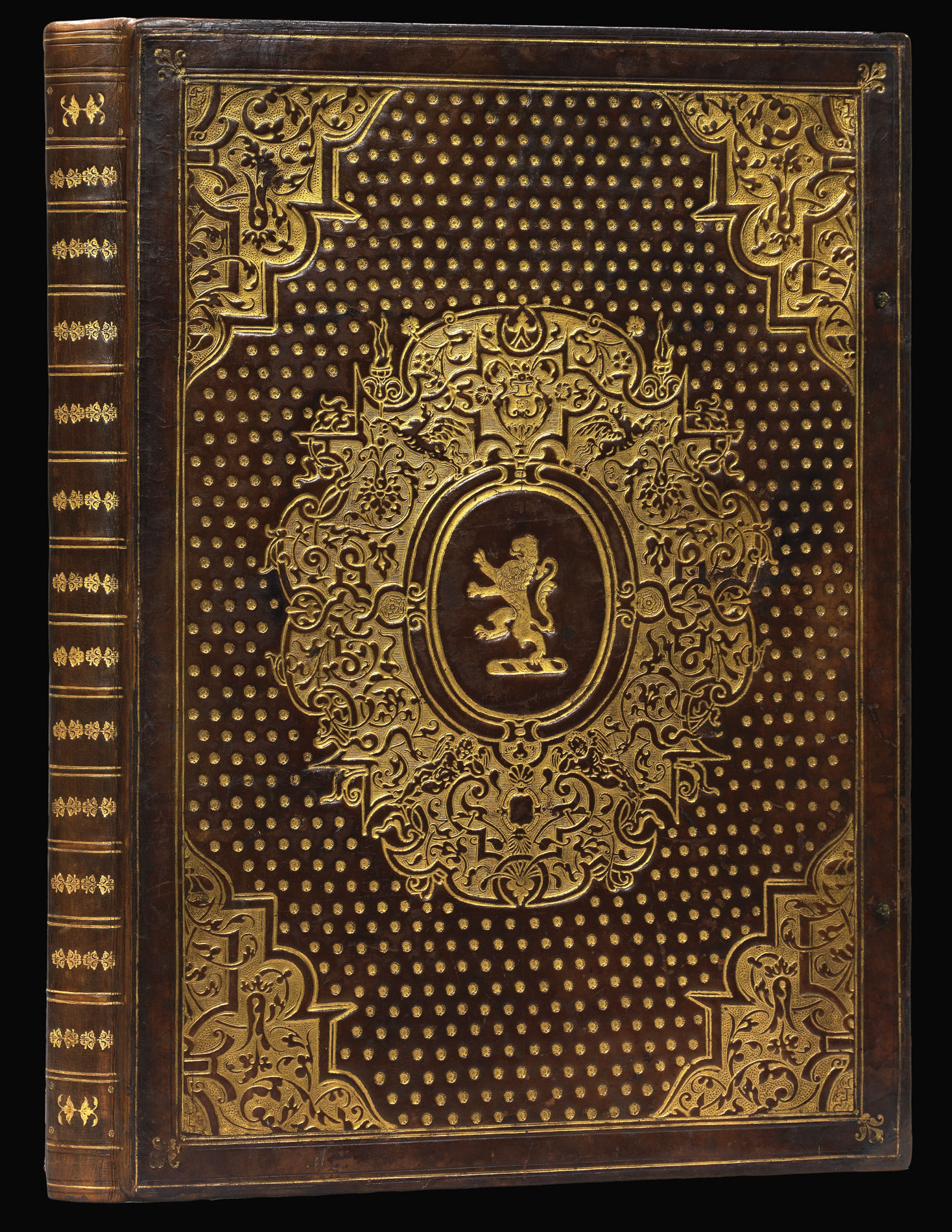
- Physical description: Folio (431 by 304mm), engraved allegorical frontispiece showing Queen Elizabeth as patroness of Astronomy and Geography, engraved plate with 84 escutcheons facing a table of towns, 35 engraved maps (one folding), letterpress index of maps, fine contemporary hand colour, heightened in gold and silver, contemporary English calf by Jean de Planche, covers gilt-blocked with large arabesque cornerpieces and large central cartouche enclosing a rampant lion crest against a background of large gilt dots, plain endpapers, gilt edges, remains of green silk ties.
- Inventory reference: 12264
Notes
First edition of the first English national atlas by the father of English cartography.
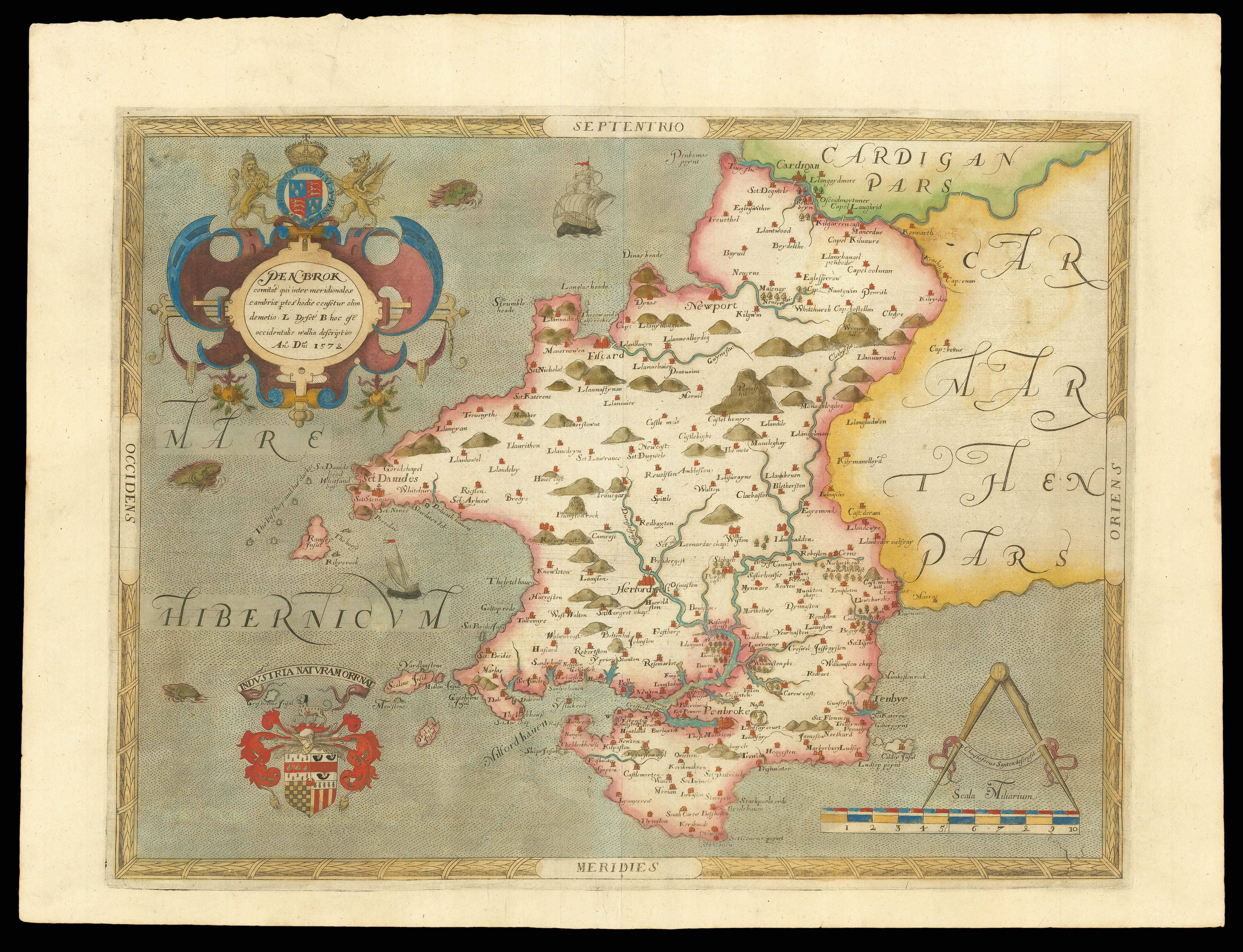
Christopher Saxton, widely considered the father of British cartography, was the first mapmaker to comprehensively survey the counties of England and Wales. The map of the entire country was the earliest large-scale representation of England and the regional maps were, in many cases, the first for their respective areas. Published in a magnificent volume in 1579, his compilation was the first atlas devoted to the complete depiction of one country and formed the basis of English regional mapping for more than a century.
Saxton grew up in Dunningly, Yorkshire and received his early training in surveying from the town vicar, John Rudd. Educated at Cambridge, Saxton’s abilities caught the attention of Thomas Seckford, Royal Surveyor to the Queen. At this time, state officials were beginning to realize the political and administrative advantage of accurate maps, while public interest in cartography was in the midst of a dramatic surge. Largely in response to these factors, Queen Elizabeth charged Seckford with the task of procuring an atlas of England and Wales. An unprecedented standard of accuracy was achieved and in keeping with the Queen’s intention that the atlas be a symbolic statement of national prominence, all care was taken to ensure that it was also beautifully produced. Each map bears the Royal Arms as a symbol of Queen Elizabeth’s supervision and endorsement.
In this edition, the frontispiece is in the usual second state, with the Queen’s skirt displaying less elaborate jewellery and the folds falling naturally above her knees. Seckford’s pre-1576 motto “Pestis patriae pigricies” appears on 15 of the maps, and 20 bear his later motto “Industra naturam ornate”. All the maps have a watermark of a lozenge of small circles, known as the grames watermark.
The atlas is bound in the lyonnaise style by Jean de la Planche (fl.1767-80), a Huguenot immigrant and member of a Dijon family of binders, who established himself in London in the sixteenth century. A colourful individual, he was arrested for bigamy. This binding is number 16 in a group of 19 bindings recorded by Howard M. Nixon in 1970.
Truusje Goedings, an expert on seventeenth century Dutch colourists, has inspected this copy and made the following report: “Splendid deluxe coloured copy, lavishly heightened with gold and silver, contemporary done by one hand. Especially the title-page is unusually elaborate, with a delicate and rich handling of gold in many details. The warm colours of the maps remind of the Flemish and Dutch colouring style of atlases around 1600, though more precise and fine, and in brighter shades especially of pink, and orange. Kindred are the minium shades for borders, the dark yellow for frames and legends, the often complete covering of surfaces of sea and regions, etc. Remarkable is the green, often applied in larger surfaces, which stayed green and has been preserved very fresh. It did not discolour to brownish-yellow as so often seen with Dutch atlases of the time – and later. This authentic fresh green is seen on maps of English provenance often and might be considered as a special characteristic of original English coloured copies of this period.
“Given the high level of painting, with drawing-like elements, the colouring of this copy might have been done by an established miniaturist-painter instead of a map colourist. The fine, drawing-like manner in which some decorations were painted and the gold was applied, as well as the more detailed than monumental overall approach of the maps and plates point in this direction. Orders for very de-luxe copies were more often given to eminent miniaturists. Moreover, professional map colourists must have been scarce in England, this atlas being the first of its kind produced in England. It might be that Flemish colourists worked on the colouring of this edition in general, just like the engraving partly was done by Flemish artists. Many of them were in London at the time. One of the best was Marcus Gheraerts also called Mr. Gerard Ter Brugghen (ca. 1521-before 1604) who was a refugee and worked for the English court since 1568 (see Van Mander 1604 p.258). He was a reknown engraver, enlighter and miniaturist, and is known to have coloured de-luxe copies of the map of Bruges (1561). He (or his son who also worked for the court) might have been involved with the colouring of this copy. (See on him my article in Kunst in Kaart (J.F. Heybroek ed.), Utrecht 1989, p.104-106, 110-113, with litt.).
“Sir Thomas Egerton, the first owner of this copy cf. his crest on the splendid gilt leather binding, was chosen as lord-chancellor by Queen Elisabeth I ca. 1690. She might have presented Egerton at his appointment with this atlas. Leading in its production she considered the atlas, which features her portrait richly coloured and gilt on the title-print, crucial for good government. Also, she employed the same binder as the one responsible for the magnificent de-luxe binding of this copy, as research showed.
“However this may be, the way of colouring of this copy does not contradict such a provenance, especially because the overall colouring of the maps is held relatively blanc, that is, the white of the paper plays a more dominant role that is usual for the time. This might be due to the fact that this copy was meant for (and presented by) a very high placed person. A somewhat paler appearance combined with costly colours was considered very chic. (For comparison: the de-luxe colouring of the presentation copy of the first edition of Wagenaer’s Zee Spiegel (Sea-Mirror, Antwerp 1584, UB Utrecht) to William of Orange has the same remarkable trait.)” (Truusje Goedings).
Provenance
1. Gilt crest to cover of Sir Thomas Egerton, Baron Ellesmere and Viscount Brackley (1540?-1617), lord chancellor and lord keeper for Elizabeth I and James I; probable gift of his third wife Alice Spencer’s family, seventeenth century inscription on the front pastedown.
2. By descent through Egerton’s daughter, the Hon. Mary Egerton, to Sir Richard Newdigate (1668-1727), with his engraved armorial bookplate on the verso of the frontispiece, dated 1709.
3. By descent to Sir Roger Newdigate (1719-1806) with his engraved armorial bookplate on the front pastedown.
4. By descent to Sir Francis Newdigate-Newdigate, Arbury Hall, Warwickshire.
5. Arbury Hall book-label sale, Sotheby’s London, 23rd January 1920, lot 289, purchased by G.D. Smith.
6. G.D. Smith stock sale, Anderson Galleries, New York, 11th November 1920, lot 290.
7. Unidentified owner sale, Sotheby’s New York, 26th June 1998, lot 602.
Bibliography
- Chubb I
- Shirley BL T.SAX-1b.
- Ifor M. Evans and Heather Lawrence, Christopher Saxton, Elizabethan map maker (London: Holland Press, 1979), 9-43
- Skelton 1
Image gallery
Related items


Sign up to hear about our latest acquisitions, exhibitions and events
Find Us
New York
PO Box 329, Larchmont, NY, USA
Opening hours, London Gallery
Monday to Friday: 10:00 – 18:00
Saturday: by appointment
Closed: all bank holidays and 1-31 August
Opening hours, New York
By appointment only