“An exceptionally fine copy of the most aesthetically pleasing atlases of the 17th century, coloured throughout probably by master Dutch colourist Jans van Santen and his studio” (Truusje Goedings)
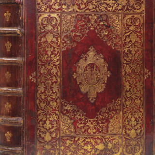
Folio (552 by 358mm), engraved frontispiece, 43 double-page engraved charts, original hand colour in outline and heightened in gold throughout, probably by master Dutch colourist Jans Van Santen and his studio, contemporary Dutch speckled panelled calf, gilt fillets, large fleurons at each outer corner and central gilt medallion of Atlas holding an armillary sphere, spine in eleven compartments with ten raised bands, gilt, red morocco title label with gilt lettering, slightly later endpapers, some guards renewed.
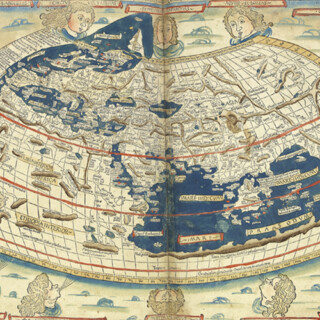
A fine copy of Pieter Goos' 'Zee-Atlas'. Finely engraved and lavishly coloured, Goos's prospective clients were "Heeren en Kooplieden" (gentleman and merchants) before "Schippers en Stuurlieden" (pilots and seamen). It was an atlas designed for the armchair traveller.
Pieter Goos (1616-1675) was one of the best-known maritime booksellers of Amsterdam, responsible for publishing a number of different sea atlases. He was an engraver rather than a cartographer himse...
A fine copy of Pieter Goos' 'Zee-Atlas'. Finely engraved and lavishly coloured, Goos's prospective clients were "Heeren en Kooplieden" (gentleman and merchants) before "Schippers en Stuurlieden" (pilots and seamen). It was an atlas designed for the armchair traveller.
Pieter Goos (1616-1675) was one of the best-known maritime booksellers of Amsterdam, responsible for publishing a number of different sea atlases. He was an engraver rather than a cartographer himself, and his work is based on the charts from Hendrick Doncker's 'Zee-Atlas' (1659), including ten charts of the Americas. The text contains a short history of navigation.
Truusje Goedings, an expert on seventeenth century Dutch colourists, has inspected the atlas and made this report: "This copy has a refined de-luxe contemporary colouring enriched with gold and silver done by one hand, except for the title-page which has been done by another colourist: its colouring is full and rich, with fine use of gold, but more flat, and somewhat less lively and variated than the other leaves. The publisher, Jacob Robijn, who added the new title-page, was known as a map colourist as well. He might have some personal responsibility for the colouring though no proof of this was found.
"The world map and charts have some specific and relevant characterists in details of their colouring, to which I will confine this description. These details correspond to the colouring of the Goos 'Zee Atlas' copy in Museum Meermanno (Magnus edition) whose colouration by Van Santen is undisputed. I know of one other copy, also a Robijn edition of 1683, which has the same characteristics (private collection, Gent, Belgium). Probably a model was employed.
"More than others Van Santen had a sophisticated colouring, in his choice of colour combinations and the way of applying, both lavishly and restrained. His handling of the brush is in general very straight and self assured, with an extraordinary degree of finesse. His original inventions in small details do not stem from an obliged, academic idea of variation, but from sensitive observation of nature, combined with keen feeling for decorative effects.
"A fine, surprising and very characteristic example of this, which corresponded with the Reland copy, I found in this copy. This is the addition of dots to the owls in the centre of the world map (not in the engraving), and also the accentuating of their eyes with gold or red. No other copy except for those mentioned above have this; they follow the approach of the engraving. Further details characteristic for Van Santen's colouring, and only found in the copies mentioned above exactly the same, are the consistent and rather sparing but delicate way the gold is applied on the world map; the complete red colouring of the bird flying under the sun (in other copies always multicoloured); and the curly golden decoration found sometimes in heraldry on maps."
bibliography:
bibliography:
Cf. Koeman IV, Rob 1; cf. Koeman IV Goos 16, Rob 4.
provenance:
provenance:
Contemporary numbering on the verso of 40 of the maps.